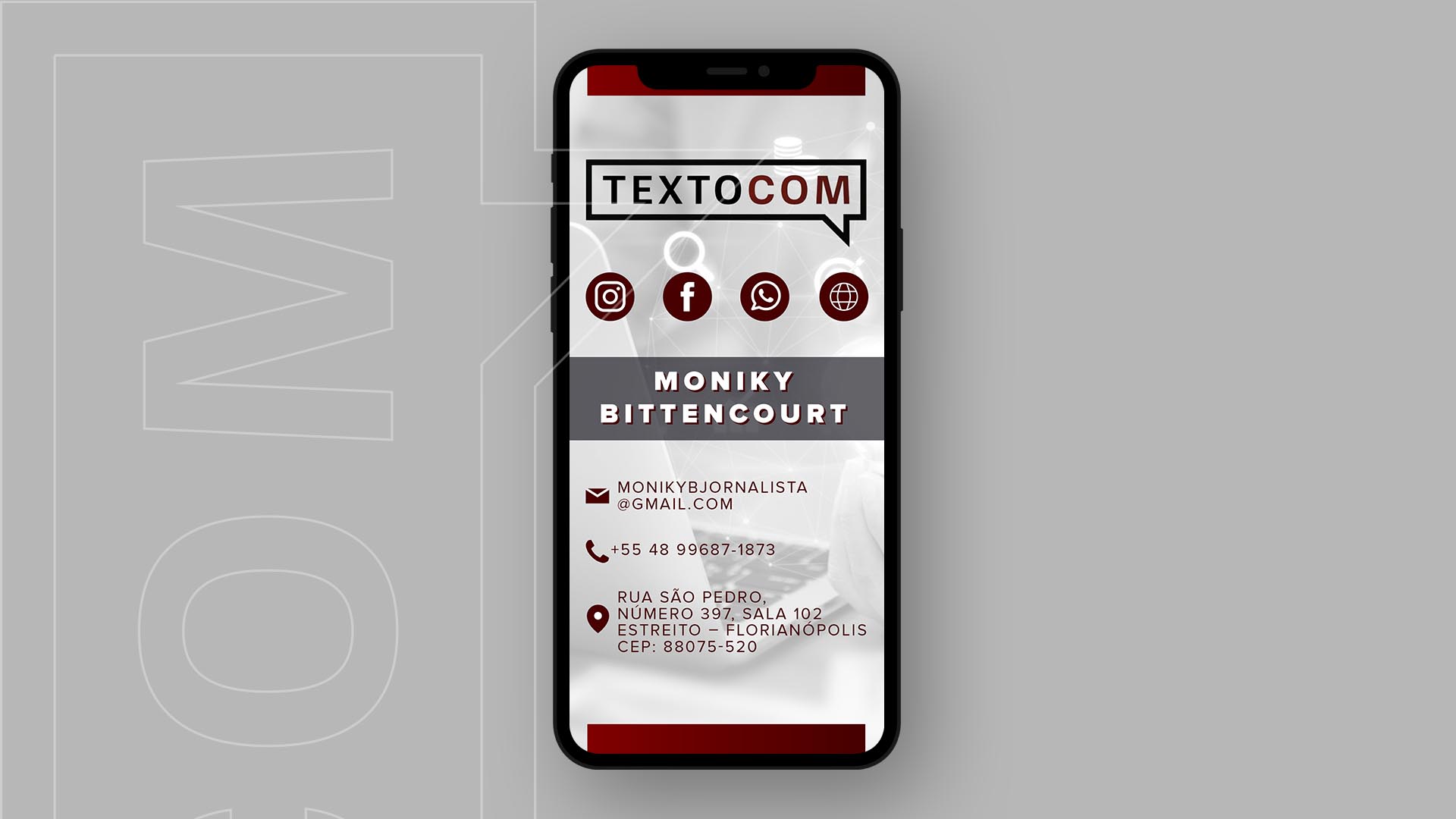
A agência de Marketing TextoCom percebeu a necessidade de atualizar sua marca porque esta precisava transmitir o conceito de comunicação e assessoria de imprensa. Além disso, destacar o mercado que a empresa é especializada – vinícolas e gastronomia. Para trazer a ideia de comunicação, foi trabalhado no emblema o elemento visual balão de fala, porém seu formato ficou retangular para representar seriedade, segurança e elegância. Internamente, o logotipo com fonte sem serifa transmite uma leitura fácil. As cores preta e bordô foram escolhidas por ter o mesmo significado do símbolo; todavia o bordô também carrega consigo a identidade das vinícolas, traz energia e estimula o apetite.
Marketing Agency TextoCom realized the needed to update the brain because it was necessary to transmit communication concept and press advisory. In addition, highlight the market that business is specialized – vineyards and gastronomy. Bringing the idea of communication, it was worked on visual element speech bubble, however its shape was rectangular to represent integrity, security and elegance. Logotype without serif conveys an easy read. Black and border color were chosen because of the same symbol meaning. However, border color also brings vineyards identity, brings energy and stimulates appetite.